
Adopting Component Driven Development with Storybook
Incorporating Modular UI Development in React Native Projects


Note: At the time of writing this post, version 8.4.4 of the @storybook/react-native package was used. Please check for the latest version or any breaking changes when following along with the integration steps.
Background
As projects scale and multiple developers contribute, maintaining scalable and reusable UI components becomes a significant challenge in React Native projects.
At my previous position, we adopted Component-Driven Development (CDD) as a methodology to address these challenges. This involved creating small atomic components, combining them into larger units, and utilizing Storybook (a tool for developing UI components in isolation). This approach enabled:
Separation of concerns: Decoupling UI and functional logic
Demo-Friendly Workflows: Showcasing components to developers, designers, and product teams without impacting the main application.
Reusable Components: Ensuring components are testable, maintainable, and scalable.
Improved Collaboration: Reducing friction across teams.
Component Driven Development
Component-Driven Development treats UI components as building blocks, starting with the smallest units and scaling upwards. The CDD hierarchy is as follows (read more here and here):
Atomic Components: The smallest, self-contained components (e.g. Button, Text)
Composite Components: Components built by combining atomic components (e.g. Card component)
Screens: Complete sections of the UI built using composite components.
With this approach, developers can work towards the following:
Scalability: Allows growing teams to work on different parts of a project independently
Reusability: Components are built to work independently and are not heavily tied to the higher components that they are used in
Consistency: Promotes the standardization of UI component development
Testability: Test coverage can be added incrementally as components are built, starting from individual elements and progressing to more complex compositions
How Storybook Complements Component Driven Development
Storybook complements CDD by enabling:
Isolated Development: Components can be built and tested without running the full app.
State Exploration: Easily simulate and test various UI states (loading, error, success, etc.).
Progress Sharing: Designers, product managers, and QAs can review components in Storybook directly, improving collaboration and reducing context-switching for developers.
Steps for Integration
Create a new Expo project
npx create-expo-app -t expo-template-blank-typescript
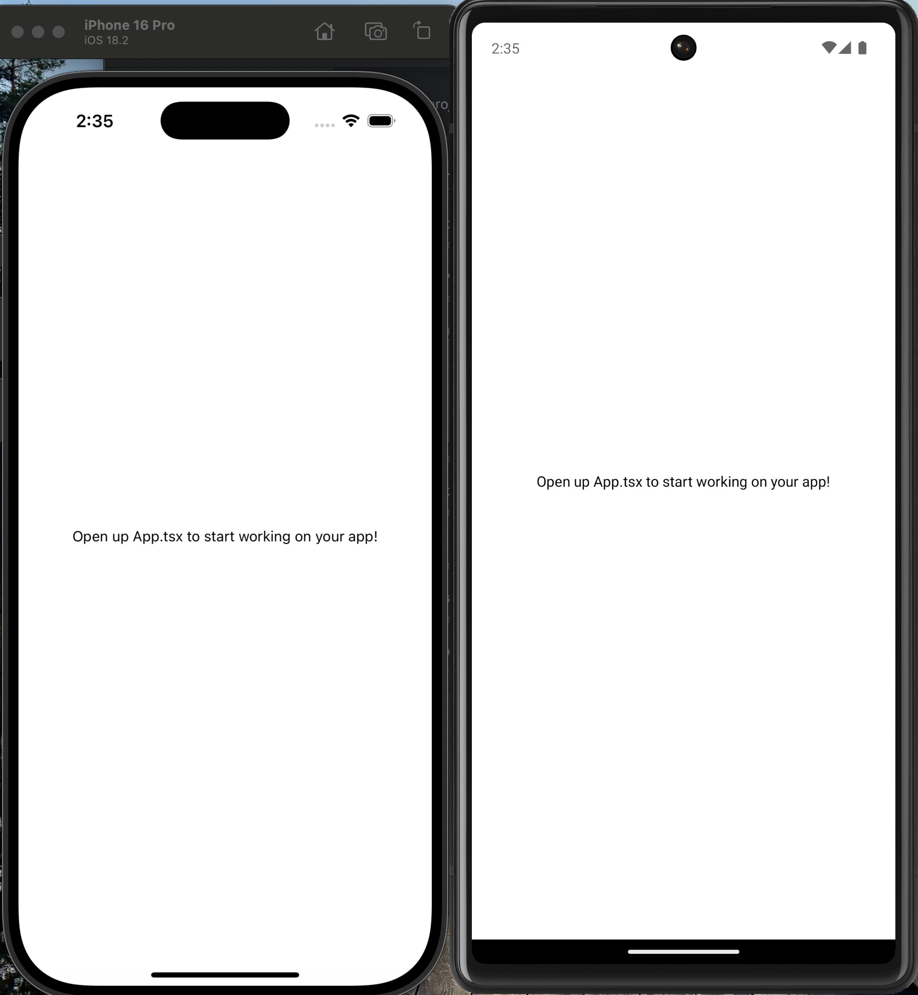
For now, run the application on either an Android or an iOS simulator or device to ensure that it is working. You should see the following.

Installing Storybook
Run the following command to initialize Storybook. A couple of dependencies will be installed.
npx storybook@latest initConfiguring Metro Bundler
Modify the metro.config.js file:
// Learn more https://docs.expo.io/guides/customizing-metro
const { getDefaultConfig } = require("expo/metro-config");

/** @type {import('expo/metro-config').MetroConfig} */
const config = getDefaultConfig(__dirname);

const withStorybook = require("@storybook/react-native/metro/withStorybook");

module.exports = withStorybook(config);
If the metro.config.js file doesn’t exist, generate it:
npx expo customize metro.config.jsUsing Environment Variables for Dynamic Setup
To control whether to launch the main application environment or the Storybook environment, we’ll use environment variables.
Install expo-constants
Since React Native (via Expo) doesn’t natively recognize environment variables, we’ll use expo-constants to inject them and make them accessible within your app.
npx expo install expo-constantsNext, create an app.config.ts file in your project directory and reference the STORYBOOK_ON environment variable:
export default {
	expo: {
		name: "STutorial",
		slug: "s-tutorial",
		version: "1.0.0",
		extra: {
			STORYBOOK_ON: process.env.STORYBOOK_ON,
		}
	}
}
This configuration makes launching the Storybook environment dynamic by toggling it based on the value of process.env.STORYBOOK_ON.
Update the Package Scripts
Add the following scripts to your package.json. We will use the second script afterwards.
"storybook-generate": "sb-rn-get-stories",
"storybook-start": "yarn storybook-generate && STORYBOOK_ON=true yarn start"
Modify App.tsx to include Storybook
Update App.tsx to toggle between the main app and Storybook environments:
import { StatusBar } from 'expo-status-bar';
import { StyleSheet, Text, View } from 'react-native';
import Constants from 'expo-constants';
import StorybookUI from './.storybook'

const Main: React.FC = () => {
  return <View style={styles.container}>
  <Text>Open up App.tsx to start working on your app!</Text>
  <StatusBar style="auto" />
</View>
}

export default function App() {

  // Toggle between Storybook UI and the main app based on STORYBOOK_ON
  const STORYBOOK_ON: string | undefined = Constants.expoConfig?.extra?.STORYBOOK_ON;
  return STORYBOOK_ON === 'true' ? <StorybookUI /> : <Main />;
}

const styles = StyleSheet.create({
  container: {
    flex: 1,
    backgroundColor: '#fff',
    alignItems: 'center',
    justifyContent: 'center',
  },
});
Conclusion
Once these modifications are in place, Storybook won’t automatically run. To launch the app in Storybook mode, use this command:
yarn storybook-startThereafter, run the app on iOS or Android, and you should see the following below. This gives you complete flexibility in switching between the main application environment and the Storybook environment.
![Kapture 2025-01-16 at 21.18.29.gif [optimize output image]](https://substackcdn.com/image/fetch/$s_!bMXQ!,f_auto,q_auto:good,fl_progressive:steep/https%3A%2F%2Fsubstack-post-media.s3.amazonaws.com%2Fpublic%2Fimages%2F6bd70b5c-c2e3-4e40-9d8e-1bb7d1c22a2a_650x705.gif "Kapture 2025-01-16 at 21.18.29.gif [optimize output image]")
Component Driven Development in Action
In Component Driven Development (CDD), every UI element is treated as a component—ranging from small, reusable elements to full-page layouts. By structuring your codebase and stories appropriately, you can enhance scalability and testability.
Modify Storybook Configuration
Before, we proceed with an example, you most likely will have your components stored in some other directory such as src/components. Navigate to .storybook/main.ts, and modify the value in the stories key to the following:
import { StorybookConfig } from '@storybook/react-native';

const main: StorybookConfig = {
  stories: ['../src/components/**/*.stories.?(ts|tsx|js|jsx)'], <- here
  addons: ['@storybook/addon-ondevice-controls', '@storybook/addon-ondevice-actions'],
};

export default main;
This way, whenever we run the command to start Storybook, stories will automatically be searched for in that directory.
Creating Components from the Ground Up
We begin with atomic components that serve as the foundation, then build composite components by combining these atomic components, and finally create page-level components to structure our layout. One file structure to achieve this is as follows:
/project-root
├── /components
│   ├── /Button
│   │   ├── index.tsx
│   │   ├── Button.stories.tsx
│   ├── /Card
│   │   ├── index.tsx
│   │   ├── Card.stories.tsx
│   ├── /HomePage
│   │   ├── index.tsx
│   │   ├── HomePage.stories.tsx
Atomic Component: MyButton
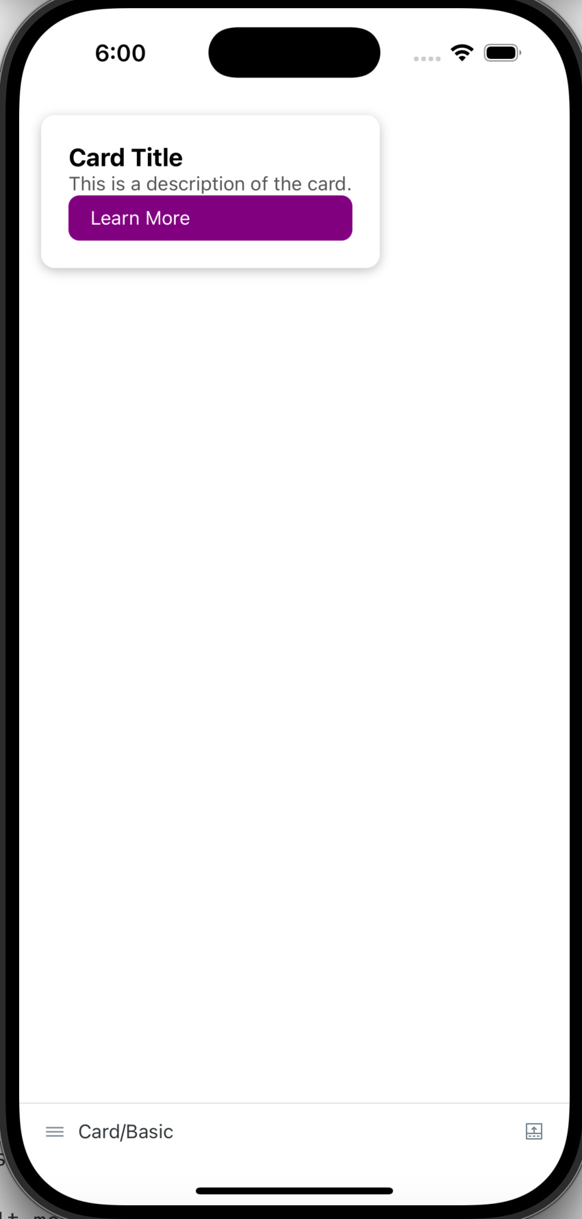
The MyButton component is an atomic, minimalistic building block designed for simple reuse across different parts of the app. It provides a basic, customizable button that can be enhanced or styled further.Code for component
import React from 'react';
import { TouchableOpacity, Text, StyleSheet } from 'react-native';

export type MyButtonProps = {
  onPress?: () => void;
  text: string;
};

const Button = ({ onPress, text }: MyButtonProps) => {
  return (
    <TouchableOpacity style={styles.container} onPress={onPress} activeOpacity={0.8}>
      <Text style={styles.text}>{text}</Text>
    </TouchableOpacity>
  );
};

const styles = StyleSheet.create({
  container: {
    paddingHorizontal: 16,
    paddingVertical: 8,
    backgroundColor: 'purple',
    borderRadius: 8,
  },
  text: { color: 'white' },
});

export default Button
Story for component
Using argTypes, you can simulate user interactions like button presses in isolation. The decorator adds layout padding for better visual representation in Storybook.import { View } from 'react-native'; import type { Meta, StoryObj } from '@storybook/react'; import Button from '.'; const meta = { title: 'Button', component: Button, argTypes: { onPress: { action: 'pressed the button' }, }, args: { text: 'Hello world', }, decorators: [ (Story) => ( <View style={{ padding: 16, alignItems: 'flex-start' }}> <Story /> </View> ), ], } satisfies Meta<typeof Button>; export default meta; type Story = StoryObj<typeof meta>; export const Basic: Story = {}; export const AnotherExample: Story = { args: { text: 'Another example', }, };![Kapture 2025-01-16 at 19.34.29.gif [optimize output image]](https://substackcdn.com/image/fetch/$s_!pxYB!,w_1456,c_limit,f_auto,q_auto:good,fl_lossy/https%3A%2F%2Fsubstack-post-media.s3.amazonaws.com%2Fpublic%2Fimages%2F52f9a354-24ce-4f80-be42-afa99e8529b6_426x901.gif "Kapture 2025-01-16 at 19.34.29.gif [optimize output image]")
Composite Component: Card
Composite components combine atomic components, like MyButton, to create functional and styled UI elements.Code for component
import React from 'react';
import { View, Text, StyleSheet } from 'react-native';
import Button from '../Button';

const Card: React.FC = () => {
  return (
    <View style={styles.card}>
      <Text style={styles.title}>Card Title</Text>
      <Text style={styles.description}>This is a description of the card.</Text>
      <Button text="Learn More" onPress={() => alert('Card button pressed')} />
    </View>
  );
};

const styles = StyleSheet.create({
  card: {
    backgroundColor: '#fff',
    padding: 20,
    borderRadius: 10,
    shadowColor: '#000',
    shadowOffset: { width: 0, height: 2 },
    shadowOpacity: 0.25,
    shadowRadius: 4,
  },
  title: {
    fontSize: 18,
    fontWeight: 'bold',
  },
  description: {
    fontSize: 14,
    color: '#555',
  },
});

export default Card;
Story for component
import React from 'react';
import type { Meta, StoryObj } from '@storybook/react';
import Card from '.';
import { View } from 'react-native';

const meta = {
    title: 'Card',
    component: Card,
    decorators: [
      (Story) => (
        <View style={{ padding: 16, alignItems: 'flex-start' }}>
          <Story />
        </View>
      ),
    ],
  } satisfies Meta<typeof Card>;

export default meta

type Story = StoryObj<typeof meta>;

export const Basic: Story = {};
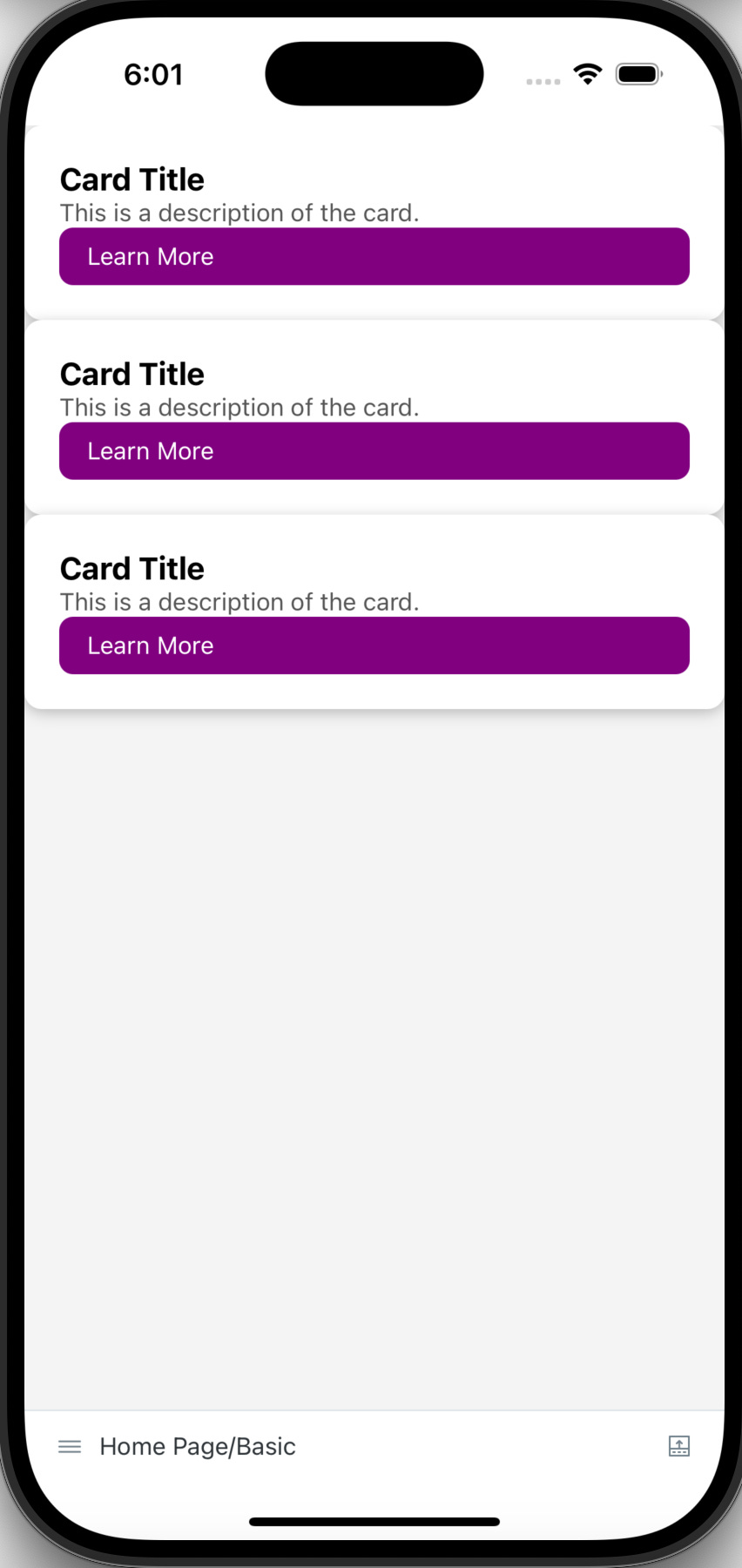
Page Component: HomePage
The HomePage combines multiple composite components, like Card, to create a page layout.Code for component
import React from 'react';
import { ScrollView, StyleSheet } from 'react-native';
import Card from '../Card';

const HomePage: React.FC = () => {
  return (
    <ScrollView style={styles.container}>
      <Card />
      <Card />
      <Card />
    </ScrollView>
  );
};

const styles = StyleSheet.create({
  container: {
    flex: 1,
    backgroundColor: '#f4f4f4',
  },
});

export default HomePage;
Story for component
import type { Meta } from '@storybook/react';
import HomePage from '.';

const meta = {
  title: 'Home Page',
  component: HomePage,
} satisfies Meta<typeof HomePage>;

export default meta;

export const Basic = {};
![Kapture 2025-01-16 at 19.34.29.gif [optimize output image]](https://substackcdn.com/image/fetch/$s_!pxYB!,f_auto,q_auto:good,fl_progressive:steep/https%3A%2F%2Fsubstack-post-media.s3.amazonaws.com%2Fpublic%2Fimages%2F52f9a354-24ce-4f80-be42-afa99e8529b6_426x901.gif "Kapture 2025-01-16 at 19.34.29.gif [optimize output image]")

Conclusion
By following this structured approach, you can ensure that your components—whether atomic, composite, or page-level—are independently tested and scalable. This process enhances collaboration and accelerates development, especially in team environments. If you would like to, feel free to add test coverage at each level.
To see a working example and get a better idea of how the components and stories are organized, feel free to visit the GitHub repository here.
Thanks for reading! If you’d like to stay updated on future posts, feel free to subscribe below for free and support my work.